Planar Simplicity
It's time for Comic Art Gripes: part one of many!
I find a lot of comics art to be difficult to understand visually. One of the reasons for this is when the artist prioritizes drawing muscles over treating the character as a three-dimensional mass. This has the effect of making the figure look like a bunch of lumps arranged on the floor and covered by a rug. It flattens them. These overworked, flat forms don't look very much like a real human being.
Here's an example! It's Spiderman:
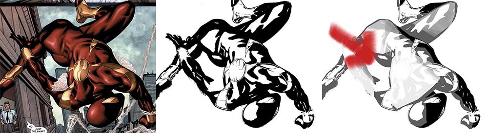
Spiderman is swinging off, outside in the sunlight. Look at all those muscles, picked out in red and gold. Shiny shiny shiny. Every muscle is shaded individually. In the black and white version, every single muscle has its own large white highlight and its own dark black shadow. If you squint at the middle Spiderman, he blends to an all-over average of grey. The detail is taking priority over the body.
In the third picture, I've put a big red arrow showing where the light is coming from. I used the highlight on Spiderman's head to estimate the angle. Looking at the light, it's obvious that Spiderman's back and shoulders are getting hit most directly. However, they're not the brightest part of Spiderman's body in the drawing. It's the same as his butt and his legs, which are struck more indirectly by the sun.
Using photoshop and a mouse, I've roughed in the brightest areas and lightened them, reducing the contrast there. Instead of each muscle being shaded from black to white, the shadows that are getting hit by the sun are light grey, closer to white. In the indirect sunlight, the shadows are still black. This means that Spiderman's body as a whole is shaded from black to white. If you squint at the third picture, instead of a grey silhouette you get something with light spots and dark spots. You can lose the detail without losing the fundamental form of Spiderman.
So, back to the title of this post. We can imagine any solid as a collection of planes, flat surfaces joined together to make a sort of very complicated polygon, like a 3D character in a computer program. Good drawings, ones that have a convincing sense of mass, focus first on the largest planes. For example, the large span of Spiderman's back. That should take priority over the smaller, more complex planes of this trapezius muscles. After all, the point of the drawing isn't that Peter Parker has sick traps. The point is that Spiderman is zipping off to do Spiderman stuff.
Too often, comics art fails the consider the simple, important planes that define the body before they consider the details. They fail to sit back, look for the fundamental, simple shapes, and consider how the light will touch them.
One final note: the picture of Spiderman I chose is one I was initially picked for its crazy anatomy. Look at how insanely long they've made Spidey's thigh so they can show you his entire ass. Amazing. However, after looking at it longer, I think the bad anatomy is a secondary issue. Comic characters get slammed a lot for not having bones, but I think that problem springs from the artist trying to draw a 2D picture that looks good because it's detailed instead of a 2D picture that looks good because it effectively conveys weight and movement.
That concludes today's gripes! That got longer than I expected. Now I'm going to go read more comics.
I find a lot of comics art to be difficult to understand visually. One of the reasons for this is when the artist prioritizes drawing muscles over treating the character as a three-dimensional mass. This has the effect of making the figure look like a bunch of lumps arranged on the floor and covered by a rug. It flattens them. These overworked, flat forms don't look very much like a real human being.
Here's an example! It's Spiderman:
Spiderman is swinging off, outside in the sunlight. Look at all those muscles, picked out in red and gold. Shiny shiny shiny. Every muscle is shaded individually. In the black and white version, every single muscle has its own large white highlight and its own dark black shadow. If you squint at the middle Spiderman, he blends to an all-over average of grey. The detail is taking priority over the body.
In the third picture, I've put a big red arrow showing where the light is coming from. I used the highlight on Spiderman's head to estimate the angle. Looking at the light, it's obvious that Spiderman's back and shoulders are getting hit most directly. However, they're not the brightest part of Spiderman's body in the drawing. It's the same as his butt and his legs, which are struck more indirectly by the sun.
Using photoshop and a mouse, I've roughed in the brightest areas and lightened them, reducing the contrast there. Instead of each muscle being shaded from black to white, the shadows that are getting hit by the sun are light grey, closer to white. In the indirect sunlight, the shadows are still black. This means that Spiderman's body as a whole is shaded from black to white. If you squint at the third picture, instead of a grey silhouette you get something with light spots and dark spots. You can lose the detail without losing the fundamental form of Spiderman.
So, back to the title of this post. We can imagine any solid as a collection of planes, flat surfaces joined together to make a sort of very complicated polygon, like a 3D character in a computer program. Good drawings, ones that have a convincing sense of mass, focus first on the largest planes. For example, the large span of Spiderman's back. That should take priority over the smaller, more complex planes of this trapezius muscles. After all, the point of the drawing isn't that Peter Parker has sick traps. The point is that Spiderman is zipping off to do Spiderman stuff.
Too often, comics art fails the consider the simple, important planes that define the body before they consider the details. They fail to sit back, look for the fundamental, simple shapes, and consider how the light will touch them.
One final note: the picture of Spiderman I chose is one I was initially picked for its crazy anatomy. Look at how insanely long they've made Spidey's thigh so they can show you his entire ass. Amazing. However, after looking at it longer, I think the bad anatomy is a secondary issue. Comic characters get slammed a lot for not having bones, but I think that problem springs from the artist trying to draw a 2D picture that looks good because it's detailed instead of a 2D picture that looks good because it effectively conveys weight and movement.
That concludes today's gripes! That got longer than I expected. Now I'm going to go read more comics.